THE CHALLENGE
I was brought in to improve the digital presence of an Afro-Cuban art collection, the largest private collection of its kind in the world. This consisted mainly of upgrading the webpage, but also included creating writing tone and taking over the social media management.
You can view the finished product here, otherwise scroll below for my research and process.
RESEARCH AND ANALYSIS
Approach
My first step was to get to grips with the collection and its website.
The website was designed on WordPress, but had not been updated for several years so I also needed to understand the CSS and html code. Plugins had been causes cascading errors so my interventions had to be checked clearly. While doing this, I needed to assess usability on desktop and mobile while also exploring potential improvements.
Competitive Benchmark
The Competitive Benchmark took other collection websites such as the Zeitz Mocca and The Zabludowicz Collections as a starting point. I then isolated several key features of each collection as well as created a ‘house-style’ of writing and information architecture.
This process revealed the necessity for a cohesive brand identity, good SEO and the importance of blog content.

Flow/Structure
I needed to understand how the collection interplays with the website – how did users access the information and why? To start, I created a wire-frame of the website, user-flows and a basic architecture of the site.
From my initial sketches and maps, I realised that the ‘News” and ‘In Context” sections served similar functions. The distinction was increasing cognitive load for users. I decided to combine these as a single navigation page in the redesign.
Usability Testing/ Interviews
My first steps in usability was to get familiar with the website myself. I initiated myself into its workings before tasking several users to do the same. These users were interviewed afterwards or recorded during.
Usability Findings
•Initial testing revealed that while the website was usable on desktop, it was not mobile-friendly.
•Users reported that the site felt dated. The first impression was that the landing page image was overly confrontational.
•The colour palette was bright which translated to the viewer as cheap.
•The site was accessed primarily on desktop.
•Site health was poor
•Accessibility and SEO were poor
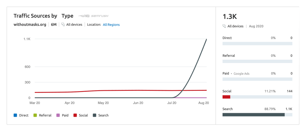
SEO/Site Health
I used SEMRush to get a profile of the collection website and applied my findings to the copy.
The most significant revelation using this process was that the website had no encryptions, decaying site health and no alt texts. These all contributed to a poor SEO profile and low accessibility.
My research revealed that website needed improvement in structural coding, copy, image captioning and in domain hosting – an overhaul. It became clear that I would need to redesign the entire system.
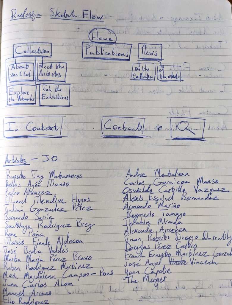
First Collection/Website interplay sketches 
Landing Page Elements
THE OVERHAUL DESIGN
My design, using flows, wire-frames and general interface sketches established a page hierarchy. I sketched the landing page to be image-heavy (with an appropriate landing image) and to have a clear layout that could be immediately recognised.
The design also needed to be malleable to accommodate future interventions, such as Private views, hence the repeatable Text/Image; Image/Text format of sections.
Style
I prepared the following mood-board as style-guide for my employer. This communicated a rough design overview to stakeholders before they gave sign-off on the redesign.
Typefaces
The headings use the serif typeface Garamond.
The body uses the san-serif Open Sans.
Both typefaces are easy to read and browser defaults making them quick to load.

PROTOTYPE DESIGN
My prototypes took place on the Word Press website. It was adjusted real-time and I took analytics as I processed. I was short of funds and time, so this was a solution devised to allow me to gather data while simultaneously designing and researching.
I changed the landing image, softened the colours and updated copy. I also added in UI features, such as Parallax scrolling and subtle fade-in effects for images.
Once I trialed the prototype and I began designing the new website on Artlogic CMS system, chosen after extensive research into art-specific CMS systems. I had pitched designing on Web Flow, but the owner decided that an art-specific system would allow for the most reasonable maintenance.

THE FINISHED PRODUCT
Landing Page
The landing page is a simple grid design, with open rows for different sections. It is uncluttered and clear, designed to have immediate links accessible to reduce bounce-back.
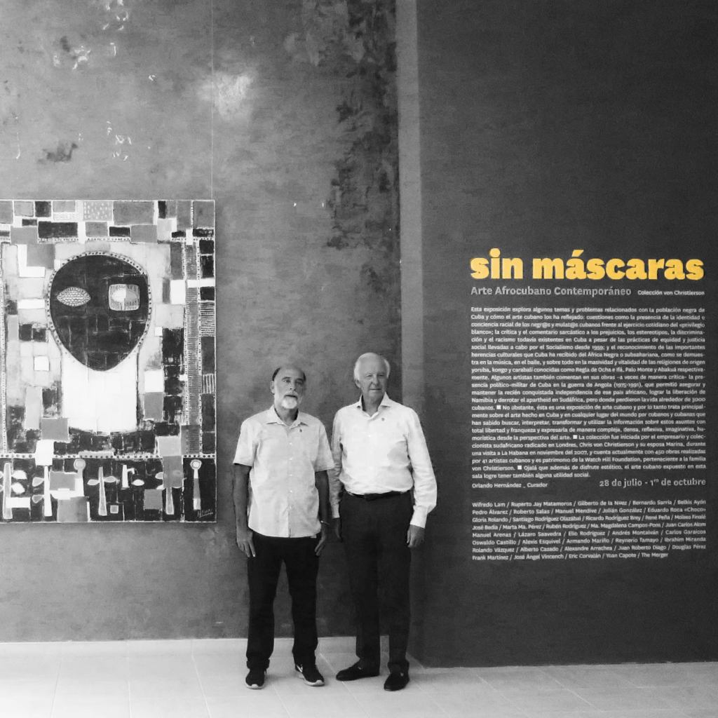
The navigation pane indicates core structure of the website. The landing image is chosen from Roberto Salas’s El Ultima Cabildo photo series, a core work from the collection.
The “Featured” section presents a rotating highlight of news and blog posts, allowing users to dive in quickly.
The technique/genre/artist search function has been removed from the landing page. This is in conformance with Hick’s law which suggests that an abundance of choices overloads the user.

COLOUR
Cohesive colour palette using muted reds, yellows and blues, with black and white. The hues of these have been lifted from a Cuban flag.
The website uses large areas of white to give sense of space.
Images used have been edited to have a shared visual language: high-contrast black and white with splashes of colour:
“Having small touches of colour makes it more colourful than having the whole thing in colour”
― Dieter Rams
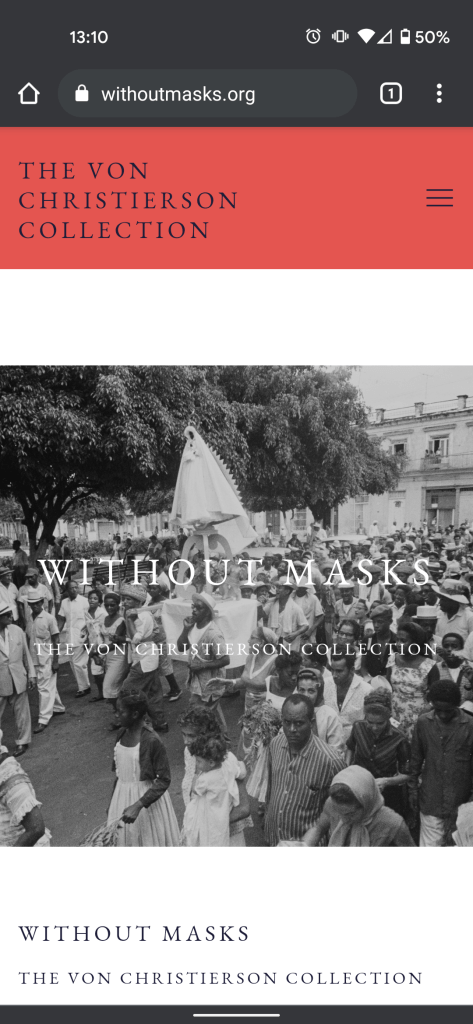
Mobile-Friendly
The website was designed on a Responsive System with Mobile design in mind. While it is currently a desktop-first website, mobile is increasiblgy important for the future of the website. This means that it was designed with the intention of being used on a phone. As of 2017, users spent more overall time on mobile than desktop viewing online sources.

Mobile Landing Page 
Mobile Artworks View 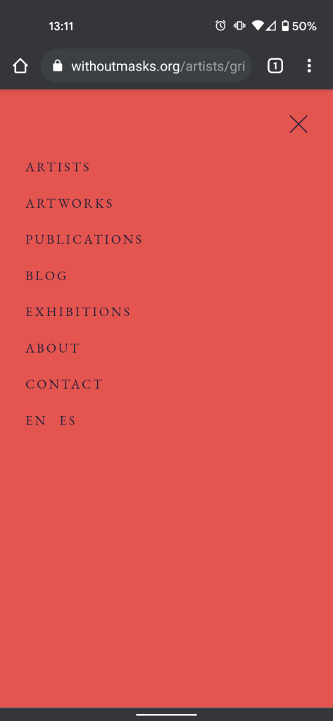
Mobile Hamburger Menu
View the website here.
Thank you for exploring this project. If you have any questions, please don’t hesitate to get in touch.
BACK TO PORTFOLIO
BACK TO HOMEPAGE
 Rafael Powell