A Product Design Research and Prototype Journey
See below how I used research and problem-solving to create a mid-fidelity prototype for an online booking system.
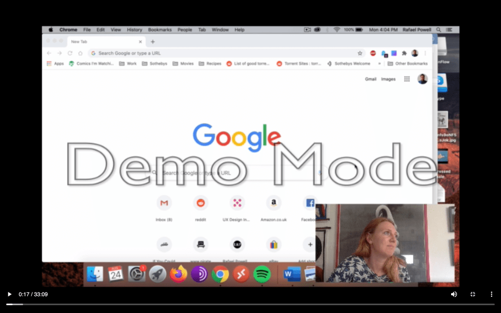
Click below to test the product.
THE CHALLENGE
To create a functioning prototype for an online flight-booking system using industry-standard techniques and proceses.
RESEARCH
Benchmark and Systems Usability Tests
The first step was to understand the mental models and interface conventions. This started with a competitor benchmark to isolate key features of common working flight booking systems – like date-pickers or automatic return flight selection. This helped me gleam the functional language of online booking systems.
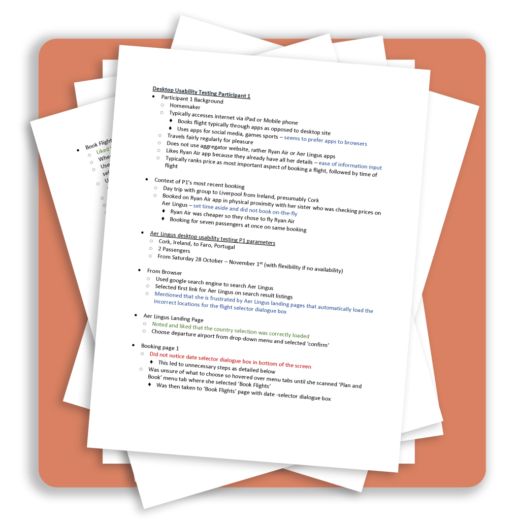
Next, I conducted interviews and filmed usability tests using British Airways and Ryan Air as case studies. I wrote observational usability test notes. My data was starting to come together
Affinity Diagrams and The Power of Collaborative Thinking
My interviews helped gather observations, but I still had to analyse the data… but how? How could I get my transcripts, observations and competitor benchmarks into workable data?
The answer lay in teamwork and Affinity Diagram analysis. For prep, we took all the notes, research and observations and recorded every concept we could find on sticky-notes. From there, we started moving the notes around a table and a wall, grouping them into loose categories . By chunking concepts in this fairly free manner, my team-mate and I managed to create organic groups to work our data into. By working in a team, we guarded against individual bias.
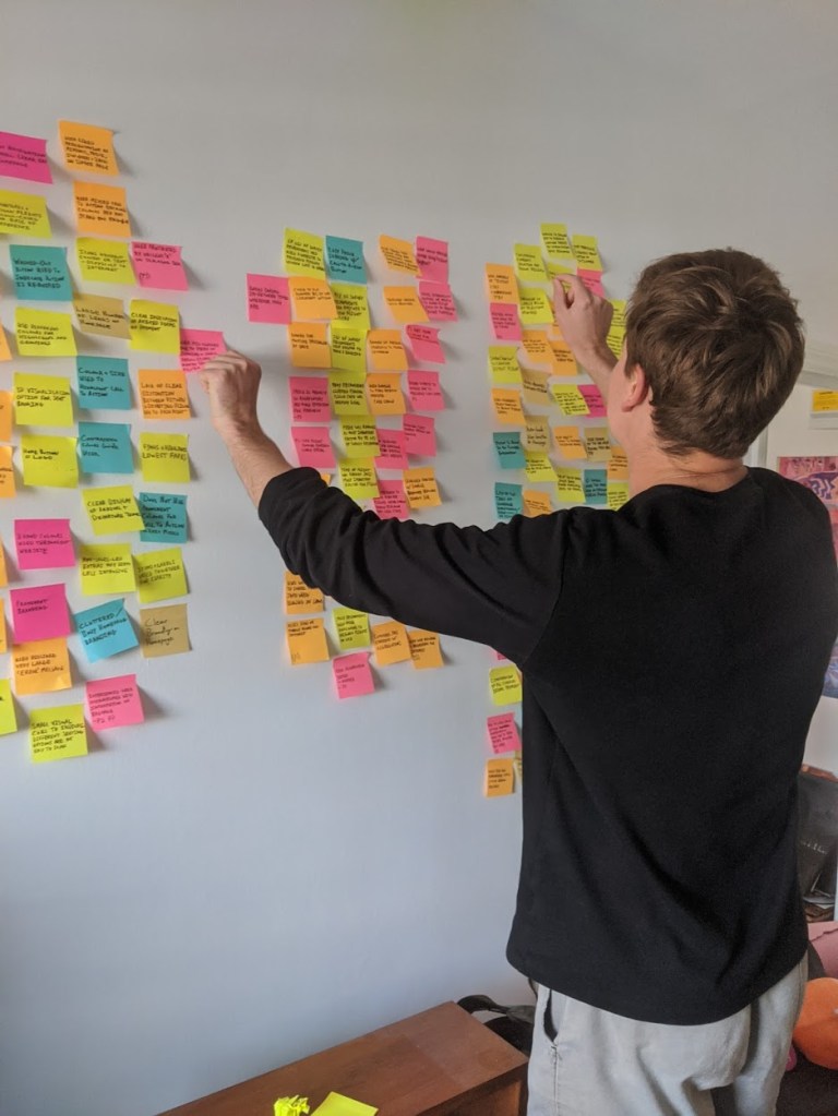
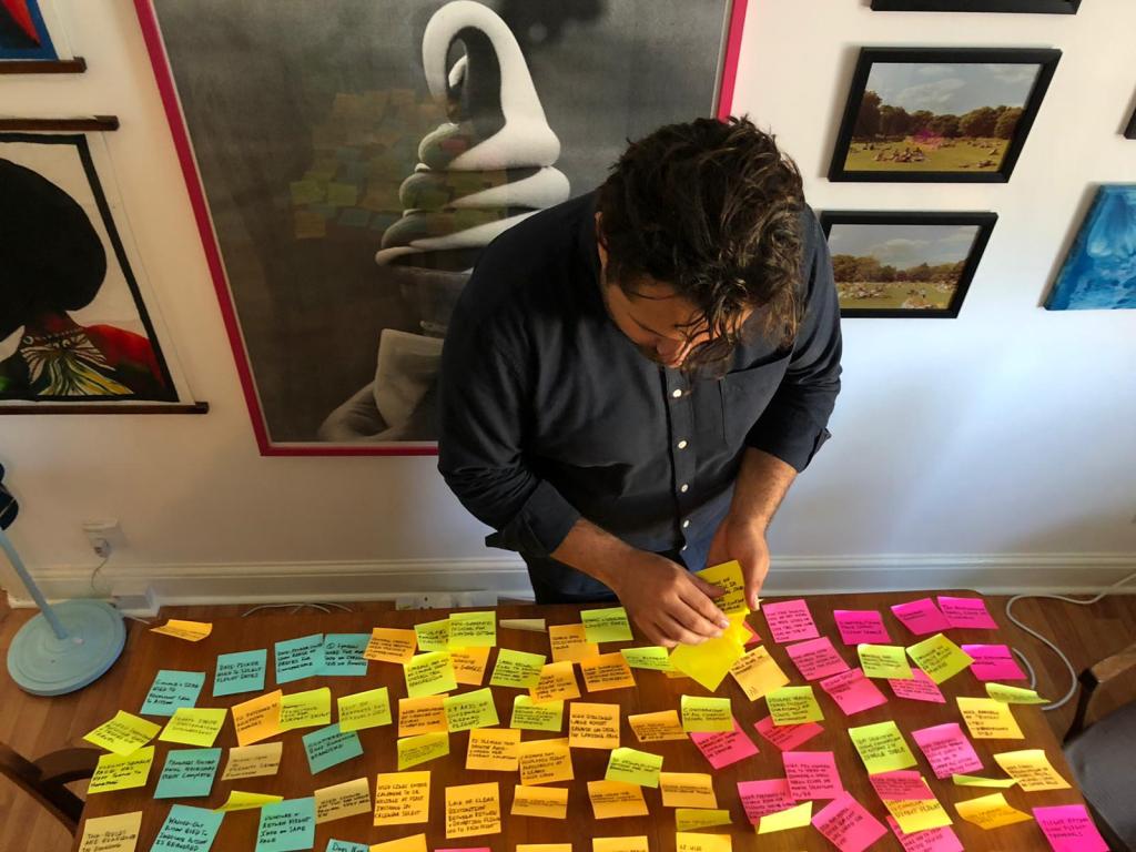
We ended up with 12 categories to house our observations. These categories ranged from steps in the booking process through to pain points. An interesting category was “At The Airport” which reminded us that the user was booking to complete a process, travel, and that the booking was not the end in itself. I’ve found this lesson valuable as it helps me remember that good systems are tools, not ends in themselves.
Customer Journey Mapping and Creating a Flow
The Affinity diagram gave me categories, such as the Pain Points or User Priorities, but it didn’t give me the design. It was time to leave the safety of observations and start designing the flow.
But, to travel away from home, you need a route and to start designing a flow, you need a map, a Customer Journey Map. This map allowed me to get an idea of how users would travel through the booking system. I created an 8-step Customer Journey for the booking process. These 8-steps loosely mapped to the 8 tasks that needed to be accomplished before a user could successfully book a flight. I recorded obvious pain-points and user expectations for each step. This map would be my reference for future design decisions as it summarised my normal-user processes.

DESIGN
Flow Charts and Decisions Along the Way
The Customer Journey Map helped me understand user routes, but it didn’t explore the decisions and functions users would take and need along the way. To get to grips with this, I needed Normal Use Case Flow Diagram. The flow created a normalised view of how a user may make their way through the system. But it didn’t quite give me how? For that, I needed to start sketching some interfaces.

Interaction Design
My interactions sketched begin to show the controls and interfaces needed to explore the customer journey. I started rough, on paper, to get a feel for the screens and interfaces. This was quick and easy and acted as a sketch to the more polished interfaces created on Adobe XD. Based on Fitt’s Law, I knew the booking button should be big and bold, and that the search function should be present from the get-go.
Wire Framing
My interactions made sense and everything was starting to come together, but I still didn’t have enough to create a solid prototype. I took my interaction sketches and enhanced them with Wire Framing. Again, Fitt’s Law came into play, as did Hick’s Law (which here suggested that one should limit extraneous options to reduce cognitive load). The result is a process that is as free from distractions as possible while still offering necessary functionality.
PROTOTYPING
Prototype
I now had enough to create a prototype. The prototype had some core functions and animations and contained each major page combined with the user flow.
From here, the prototype could be taken to the next level with a high-fidelity design and engineering. Using all my research, analysis and design skills, I created an industry-standard system that could hold up against any others in the game.
Find it here. Try it out, it’s fun.
Thanks for exploring my first User Experience story. Check out my Portfolio for more of my work or contact me to enquire about my current projects.
